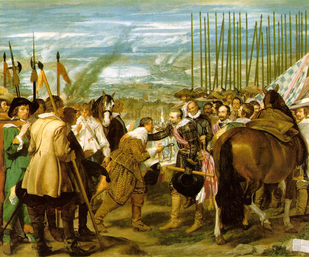
Another Baroque artist... I'm starting to think I put my foot in my mouth in the last post by saying I don't like Baroque art. Diego Velázquez, a Spanish painter well known for realism and portrait art. At 24 he became head artist in the court of King Philip IV. Even though Velázquez is most known for his painting Les Meninas, a snapshot of a moment in the palace of King Philip IV, I've decided to write about my favorite painting by him, The Surrender of Breda.
Diego Velázquez. 1934. Oil on Canvas.
In all honesty this is my favorite painting by Velázquez because of the name of the artwork. One of the worst reasons to like a painting, but I can't help loving the name "Breda."
The history behind The Surrender of Breda is that Ambrosio Spinola (man in black on the right) captured the city of Breda in 1625 from the Dutch republic, which was a great success for the Spanish arms. Velázquez was very good friends with Spinola and after his death in 1630 he wanted to paint The Surrender of Breda as a a tribute to the great general. There is a great respect shown towards the Dutch as they hand over the city of Breda. Velázquez over exaggerates the dignity Spinola gives to the Dutch army. It is said that Spinola “had forbidden his troops to jeer at, or otherwise abuse, the vanquished Dutch." But the fact that Spinola so peacefully conquered Breda the same way shown in the painting is unsure.
Photo and Information gathered from http://www.canvasreplicas.com/images/Surrender%20of%20Breda%20Diego%20Velazquez.jpg, http://www.ibiblio.org/wm/paint/auth/velazquez/, http://www.carolsutton.net/breda/velazquez.html
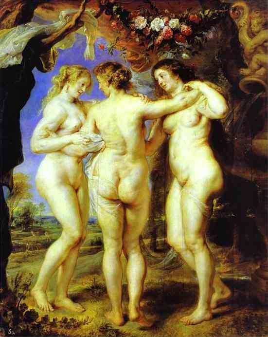
Since I've been studying Art History, I have never found myself to be a big fan of the Baroque era. But I fell in love with the artwork by Peter Paul Rubens. The Baroque era was all about movement, color, and sensuality, and the female body. Rubens loved to paint mythological subjects, something I always found fascinating. I remember learning about mythology in high school by one of my more favorite teachers. The subject captivated me for many years. One of the paintings I was introduced to while studying Rubens was The Three Graces. The 15th century painting is capturing the goddesses of charm, beauty, nature, human creativity and fertility in Greek mythology.
Rubens has a wonderful way of depicting these three women. He has them all standing in very sensual position. They're bodies curving from head to toe, showing a sense of movement. These are key focuses for the Baroque style. The death of his first wife, Helene Fourment, was his influnce for his Rubenesque style of painting. Rubens created a series of paintings with "plus-sized" women such as The Feast of Venus, The Judgment of Paris and of course The Three Graces.
At age 14, Peter Paul Rubens started his artistic apprenticeship with Thobias Verhaeght. Nine years later he traveled to Italy to start studying famous works in museums. He was greatly influenced by the work of Titian and the influence can easily be seen in his artwork.
Photos and Information gathered from http://www.abcgallery.com/R/rubens/rubens49.html, http://www.peterpaulrubens.org/
Vincent van Gogh was a man of many jobs before finding his love as an artisti at age 27. He held a ten year career as an artist before he death in 1890. In the short time he lived he was able to produce over a thousand works, nine hundred of them being completed paintings. Two years before he passed he created The Café Terrace on the Place du Forum, one of the first paintings where van Gogh demonstrated a star filled sky.
The Café Terrace was first exhibited in 1892 and was titled Coffeehouse, in the evening (Café, le soir). It was later renamed after letters were found from van Gogh talking about the piece and how he referred to it.
van Gogh wrote to his sister:
"I was only interrupted by my work on a new painting representing the exterior of a night café. On the terrace there are small figures of people drinking. An immense yellow lantern illuminates the terrace, the facade, the side walk and even casts light on the paving stones of the road which take a pinkish violet tone. The gables of the houses, like a fading road below a blue sky studded with stars, are dark blue or violet with a green tree. Here you have a night painting without black, with nothing but beautiful blue and violet and green and in this surrounding the illuminated area colours itself sulfur pale yellow and citron green. It amuses me enormously to paint the night right on the spot. Normally, one draws and paints the painting during the daytime after the sketch. But I like to paint the thing immediately. It is true that in the darkness I can take a blue for a green, a blue lilac for a pink lilac, since it is hard to distinguish the quality of the tone. But it is the only way to get away from our conventional night with poor pale whitish light, while even a simple candle already provides us with the richest of yellows and oranges."
Today people can walk the rue du Palais (Palace Street) in Metz, France and see exactly were van Gogh set his easel. The Cafe is now known as "Café van Gogh."
Photos and Information gathered fromhttp://cf.juggle-images.com/fit/white/600x600/wg-cafe-terrace-at-night-1.jpg, http://0.tqn.com/d/arthistory/1/7/1/m/vvg_cotn_moma_05.jpg, http://pics.boards.weddingbee.com/3566.van-gogh-vincent-cafe-terrace-at-night.jpg, http://www.webexhibits.org/vangogh/letter/18/W07-fr.htm, and http://www.juggle.com/cafe-terrace-at-night
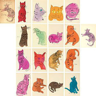
I’ve decided to make every Wednesday Warhol Wednesday because he is my true love. For my first Wednesday post I’ve been a stuck between making One Blue Pussy or Marilyn Monroe my first Warhol blog. I’ve concluded with One Blue Pussy since the artwork will be with me forever.
November of 2009 I went to Anthem Tattoo Shop and got my second tattoo. It’s of Andy Warhol’s One Blue Pussy from his book 25 Cats Name Sam and One Blue Pussy. Yes, I have a giant blue cat on the inner part of my left arm. I’ve never been more proud of a tattoo choice. I got the tattoo as constant reminded of my love for Pop Art and Andy Warhol (and of Cats). It’s my inspiration for my career in Art History.
This is a 1954, Hand-colored offset print by Andy Warhol and his mother, Julia Warhola. One on my favorite parts of this piece is the name. 25 Cats Name Same and One Blue Pussy. Julia Warhola left the “d” off of “named.” Andy didn’t correct her on this mistake because of his love for imperfections. I feel that just in this fact, there is a great deal of explanation about Andy Warhol.
Warhol and his mother started working on the books as Christmas keepsakes for all the family members. Andy always had a lot of cats and at one time he had 26. He and his mother always named them Sam, except for one who they named Hester. Andy printed and hand painted all of the cats while his mother did the calligraphy. The book only contains 16 cats and doesn’t use any text except for the cat’s names and Andy’s signatures. Sometime there is confusion with the blue cat because Warhol did a print of another blue cat that isn’t used in the book. He is not to be confused with the One Blue Pussy.
Andy Warhol his one of the most interesting artist I’ve studied. The more I read about Warhol, the more I find in common with him and fall in a deeper love. I’ve read three books by Warhol on his life and art. The Philosophy of Andy Warhol (From A to B & Back Again) has been my favorite. It is from this book that most of Warhol’s quotes are taken. I would recommend the book to anyone who is studying Warhol. Warhol covers topics such as love, beauty, fame, work, sex, time, death, economics, success, and art. He is truly a wonderful man and I’m constantly finding more fascinating things about him.
In the few years of taking Art History courses I’ve never truly studied Pablo Picasso.He was just another artist I knew a little about.The past few days I’ve been reading A Short Guide to Writing about Art by Sylvan Barnet and I came across and interesting fact about Picasso.John Richardson, the author of A Life of Picasso, wrote how Picasso’s style changed as he married and dated different women, even as he changed friends.To Richardson it is apparent that Apollinaire affected Picasso’s Cubism, Cocteau affected his Neoclassicism, and Breton affected his Surrealism. Like I said I’d never really studied Picasso or his work but to read this motivated me to look more into his life.Picasso is quoted to say “My work is like a diary.To understand it, you have to see how it mirrors my life.”I’m here now to read Picasso’s “diary” and to understand him a little bit more.
The only artwork by Picasso I was really introduced to by and art teacher was his Guernica.I first saw this artwork in my Art Fundamentals course with Professor Thompson.We were studying space on paper and how to fill space equally and interestingly.How to have something busy on paper but yet not overwhelming.She showed us Picasso’s Guernica as “the perfect example.”
Picasso painted the Guernica in 1937 for the World Fair.It was a response piece to the bombing of a Basque town in Guernica, Spain. When Picasso was asked to paint the piece he was unsure of how to convey the message through a painting.Once the news hit Paris in May the black and white images of the townspeople running for their lives and burning in the streets hit the newspapers.Picasso found his inspiration.For the next three months he worked on sketches for the painting, noting that he did not want “to represent the horror of Guernica in realist or romantic terms.”Three months later the masterwork was sent to Spain to be put on display and viewed as a reminder of the event.
As I was doing research I found a quote by Picasso that I felt goes along well with the work he put into this painting: “A painting is not thought out and settled in advance, while it is being done, it changes as one’s thoughts change. And when it’s finished, it goes on changing, according to the state of mind of whoever is looking at it.”
One of the most beautiful things of art, it’s what you make of it.
A few days ago a friend and I went onto our old college campus and as we passed the gallery we noticed there was an exhibit going on.With the both of us being art studio students, we couldn’t pass up a gallery viewing!The college had asked Dr. A. David Crown, M.D. to display his art work.I thought I would share one of the pieces that I found most familiar.
*I’ve tried to apply the picture to this post, but it doesn’t seem to be working consistently. I have supplied the link here to view the artwork if you cannot view it on this post*
Where Have You Been? A mezzotint by Dr. A. David Crown, printed in 2005. A collection of his artwork can be found at the Samuel P. Harn Museum of Art at the University of Florida or at the Santa Fe College Gallery from September 10th to November 4th, 2010.
Where Have You Been? shows the shadow of a person opening the door for a cat at the top of the steps.The artwork instantly gives off the sense of curiosity because of the dark shadows and mysterious arch under the stairwell.It looks as if it is a late night and the family cat has finally decided to return home.This artwork reminds me of the many nights my mother stayed up yelling on the front porch for the cats to come home.Always worried about where they’re at and what they’ve been up to.As soon as they arrive, meowing on the front porch, she would open the door and say Where Have You Been? making this the perfect name for this piece.
Dr. Crown works mostly in the medium of original mezzotint with is artwork.In 1997 he founded the International Mezzotint Society.Mezzotint is a form of ink block printing.The process involves pricking small holes into a metal plate to hold ink.A cradle or rocker is used to help create the holes that creates the image on the plate. Once the ink is applied the print can be made.Different plates are used to create the different layers of the artwork. Dr. Crown has been practicing this technique since he retired as a physician in 1982.
I just want to inform everyone that today I received my letter of acceptance from the University of North Florida, School of Art History.I have also applied to the University of Florida, School of Art and Art History and will be expecting that letter near the end of October or beginning of November.Wish me luck and keep me in your prayers.I hope for UF just so I don’t have to move, but it’s great knowing I have somewhere to go in the spring.
Welcome to my first blog and Thank You. When I came up with the idea to create a blog about what I love talking about most, art, I became overwhelmed with excitement. As I pondered on how things would work out and goals I would set for myself a good friend texted a picture of the painting The Three Ages of Woman by Gustav Klimt. He asked me what I thought of it and if I understood it. I decided to make this painting my first entry.
The Klimt painting is a 70 x 78 inch Oil on Canvas, painted in 1905. The current location is in the National Gallery of Modern Art (Galleria Nazionale d’Arte Moderna) in Rome, Italy. There is a detail of this painting that focuses on just the mother and child.
Gustav Klimt was an Austrian, with an art nouveau style, who died at the age of 55 in 1918. He worked with many medias beyond oil in a single painting. Many of Klimt’s paintings focus on the female body. His artworks were portrayed as very scandal for his time because of the nudity, sexuality and eroticism he expressed using the artistic view of the human body. But as Andy Warhol would say “Art is what you can get away with” and even with Klimt’s works being controversial his art was still highly admire.
In The Three Ages of Woman it is obvious that childhood, middle age, and the elderly stage is represented here. But looking deeper into the painted I notice things like the blue ribbon wrapping around the middle aged woman and how the senior is drowning in a pool of browns and oranges. There is an apparent pattern of geometric shapes found mostly on the right. To figure out what these would signify, I did some research on this painting. I found that Klimt is known for using a lot of symbolism in his artwork and he uses mythological facts to explain his symbols. In 1902 he was coping with the death of his baby son. Klimt released a series of paintings that focused on death and life after that. Knowing facts like these about an artist can greatly change the view of a painting. We can now look at the browns and oranges around the older woman as a sign of death to come, for as earth is usually represented in greens or browns. To me the blue ribbon looked as if it stood for youth and life as it wove itself around the middle aged woman and up to the child. But looking at other Klimt paintings blue is a representative for death and it’s wrapping around her as a reminder that death is always near. The painting presents the message Klimt would like to remind the world: “in life we are in death.”
UPDATE: September 22, 2010- The focus of the Mother and Child can be purchased at IKEA along with another painting by Klimt called Water Serpents II


